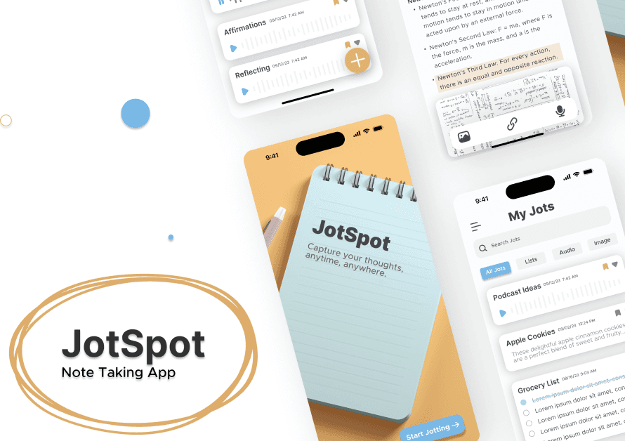
JotSpot
JotSpot is a note-taking app designed with functionalism at its core, aiming to streamline the process of capturing and organizing information. With a focus on simplicity and efficiency, JotSpot offers users a clutter-free interface and essential features tailored to enhance productivity. By prioritizing functionality over unnecessary embellishments, JotSpot empowers users to quickly jot down thoughts, ideas, and reminders without distractions. Whether it's in a meeting, lecture, or brainstorming session, JotSpot is the go-to tool for capturing and organizing notes seamlessly.
Project Overview
In response to the directive for minimal art direction and a commitment to functionalism, I embarked on the creation of interface concepts for a note-taking app. My primary objective was to prioritize simplicity and efficiency in user interaction. By focusing on functionalism, I aimed to streamline the note-taking process, ensuring that users could capture and organize information seamlessly. Through meticulous design decisions, I crafted interface concepts that embody commitment to minimalism while maximizing usability.
The Process
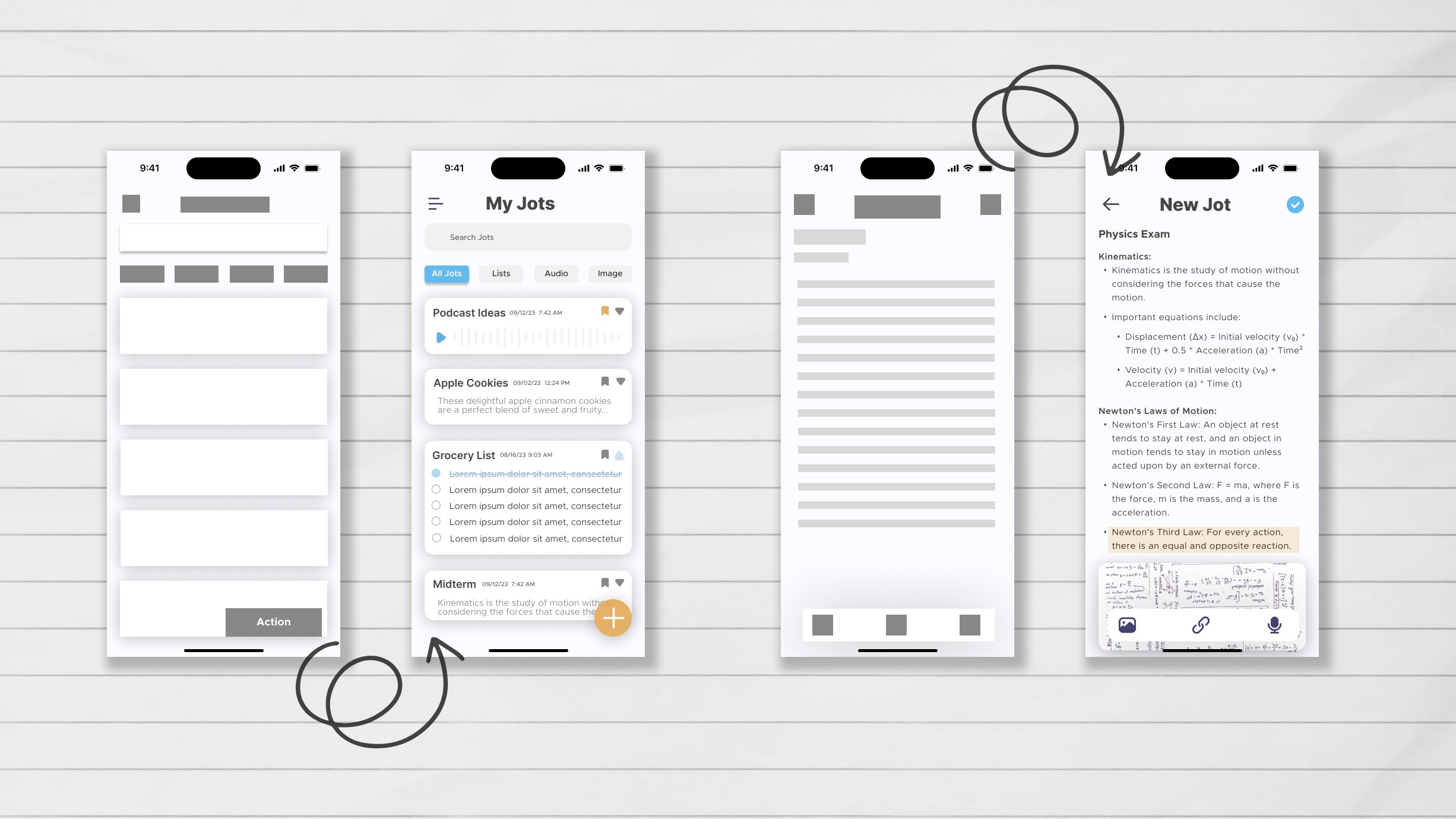
In crafting the design for JotSpot, my process revolved around prioritizing simplicity and efficiency, ensuring that users could accomplish tasks quickly and effortlessly. I began by sketching low-fidelity wireframes, focusing on keeping the user flow as concise as possible. Through iterations, I gradually refined the wireframes, transitioning to mid-fidelity prototypes to further refine the layout and interactions. Finally, I translated the design into high-fidelity mockups, paying close attention to detail while maintaining the app's clean and straightforward aesthetic. This iterative approach allowed me to create a user-friendly interface that prioritizes functionality and enhances the note-taking experience for users.
Design
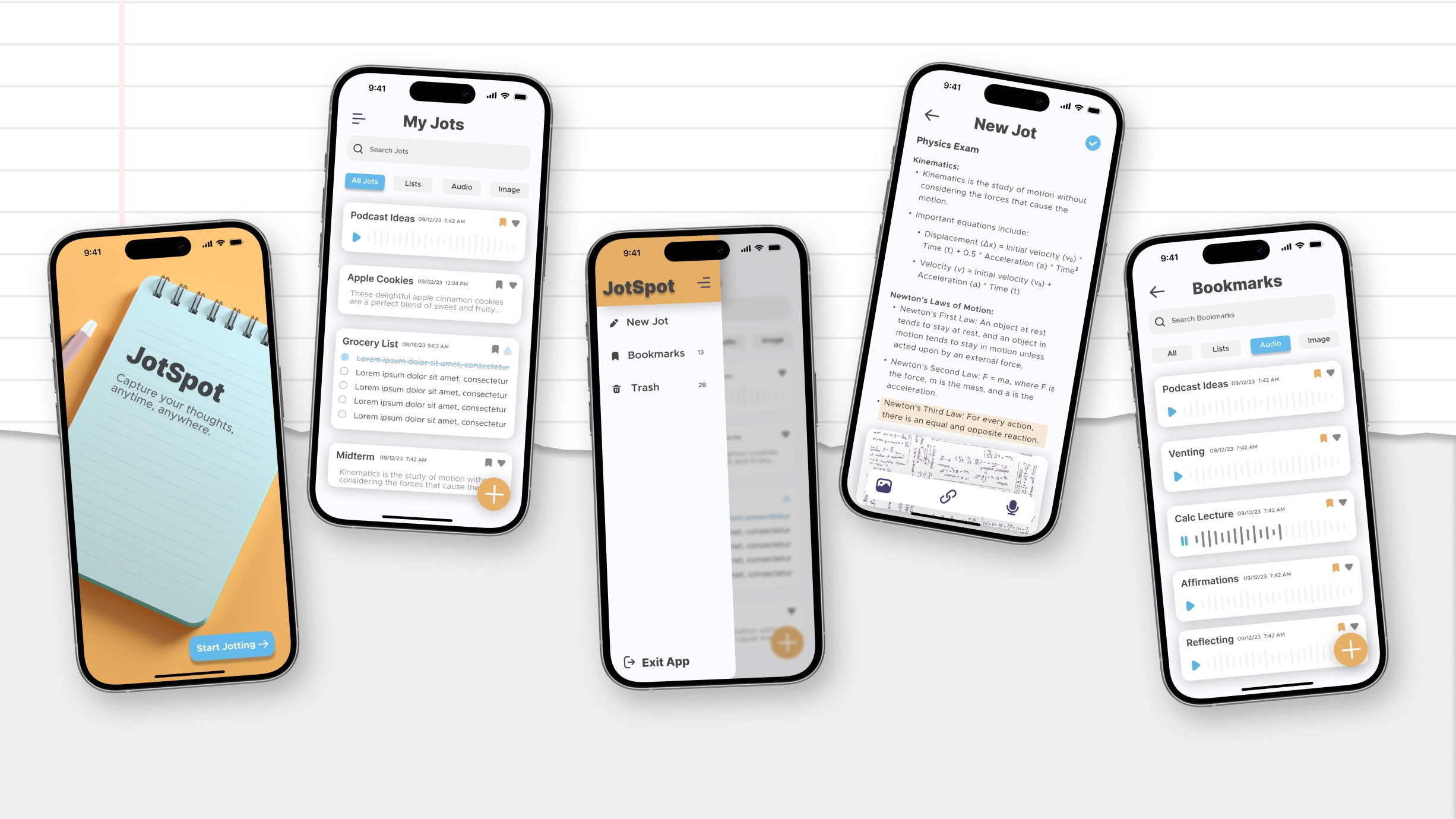
I selected the Inter and Metropolis typefaces to enhance readability and modernity within the JotSpot interface. Inter, known for its excellent legibility on screens, ensures a comfortable reading experience for users engaging with notes and interface elements. Complementing Inter, Metropolis adds a touch of elegance and contemporary style to headers and titles, contributing to the app's overall aesthetic appeal.
The color palette of vibrant orange and soothing blue, set against a crisp white background, was chosen deliberately to grab users' attention while maintaining visual harmony. The bold contrast of orange and blue not only adds visual interest but also serves as intuitive visual cues for important actions and elements within the app. Against the backdrop of a clean white canvas, these colors pop, guiding users' focus and enhancing overall usability.
This thoughtful combination of fonts and colors ensures that the JotSpot interface not only delivers optimal readability and visual appeal but also facilitates intuitive navigation and interaction.
Result
By prioritizing a minimalistic design approach and streamlining the user flow to be as small and to the point as possible, users can achieve their tasks quickly and efficiently. The transition from low-fidelity wireframes to high-fidelity mockups has allowed for continuous refinement and optimization of the interface, resulting in a visually appealing and user-friendly application. Overall, the design choices made have not only met but exceeded the initial objectives, culminating in a note-taking app that is both aesthetically pleasing and highly functional, ultimately enhancing user productivity and satisfaction.